About the Header of My Homepage
“Hard work beats talent when talent fails to work hard.”
Kevin Durant
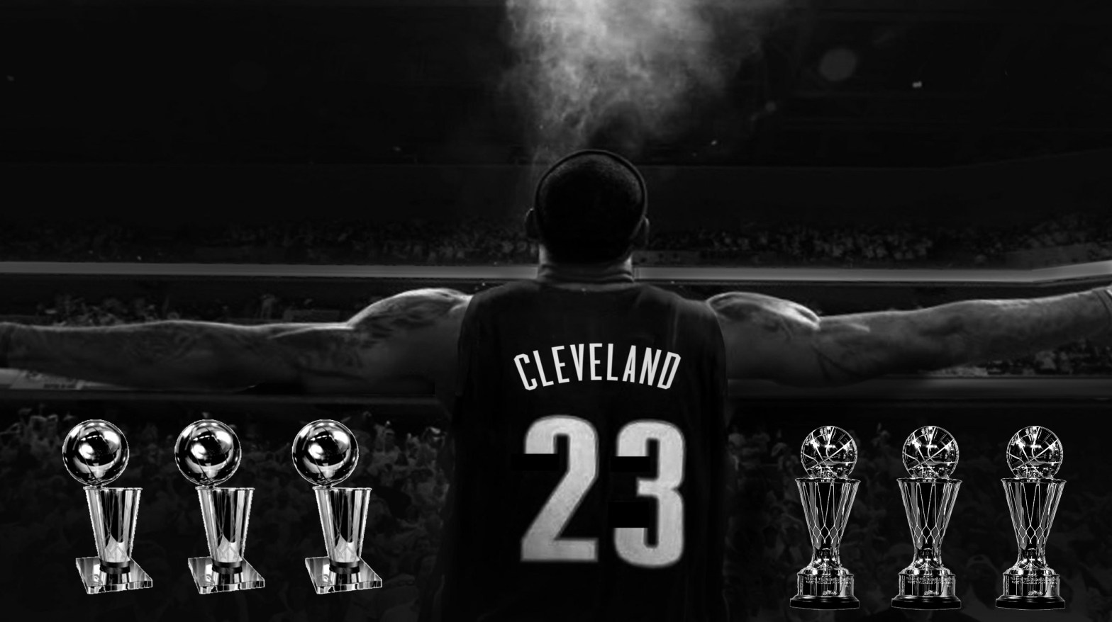
I chose and edited this image of LeBron James and his NBA Finals accolades because I felt that it properly displays how my blog will be centered around discussing the modern NBA. All of the championship accolades that LeBron has earned have come since 2010 and this is the era of NBA basketball that I’m most familiar with and will be mostly discussing. My extensive knowledge on the NBA since 2010 also lets me give the most accurate information and most well-thought out opinions that I possibly can, this way my blog content can be as informational as possible for my target audience of younger, modern NBA fans. I first found my base image of LeBron in a Google search for “creative commons + LeBron James”. This image is also the same image that Cleveland proudly displayed on the largest billboard in the city for all of LeBron’s two tenures with the Cavs. The next creative commons images I used were the two photos of the NBA Finals trophy and the Finals MVP trophy. Both of these were stock images which are also free to use, like the LeBron photo. In order to get the trophies to look how I wanted them to, I had to use the “magic wand cutout” tool on them in order to remove the backgrounds of the pictures and be left with a “mask” to work with. Once I successfully made a mask for both trophies, I then copied each of their respective layers two more times each in order to represent the actual number of awards that LeBron really has. Then once I placed each of the layers where I wanted them, I finally chose a black and white filter to make them match the base color of the LeBron photo. Unlike Manovich’s technique of overlaying a filter layer on top of each other layer, I simply applied the filter directly to the layers themselves, which ended up cutting the number of layers in half. I was already familiar with most of the techniques that Manovich described because I have worked with the professional version of Adobe Photoshop in the past, and because of this I was also aware of a few shortcuts that simplified Manovich’s techniques. There are obviously several differences between producing an image in a program like Photoshop and creating a single layer bitmap image in a program like MS Paint. The biggest and most notable difference is that a single layer bitmap image is only “a two dimensional presentation of the bits in a computer’s memory” while a Photoshopped image is essentially a three dimensional compilation of multiple images (Davison 278). While using something like MS Paint, all you’re really doing is turning on or off the pixels that you drag your cursor over and you can choose the color that the pixels are when they turn on. This is the most basic way of creating an image on a computer and it is very primitive compared to real Photoshop. In Photoshop, the image and its pixels are already pre-rendered and the user is simply editing the already finished product instead of creating an entirely new image. However, there are still elements of MS Paint in Photoshop, like the draw tool for example. This serves the exact same function as traditional MS Paint except it allows you to draw and change the pixels on a complete image.
